CLUB-MATE — Rebrand conceptuel
Ce projet propose une relecture complète de l’identité de Club-Mate, en conservant ce qui fait sa singularité : une boisson fonctionnelle, brute, ancrée dans une culture alternative.
L’objectif n’est pas de moderniser pour lisser, mais de clarifier et renforcer les codes existants. Club-Mate est une marque déjà forte culturellement. L’enjeu est donc de structurer cette force plutôt que de la transformer.
Le travail s’articule autour de trois axes :
— Clarification —
Simplifier les éléments graphiques pour améliorer la lisibilité et la reconnaissance immédiate.
— Tension visuelle —
Créer un équilibre entre héritage industriel et esthétique contemporaine.
Une approche sobre, presque utilitaire, qui évite toute sur-stylisation.
— Système —
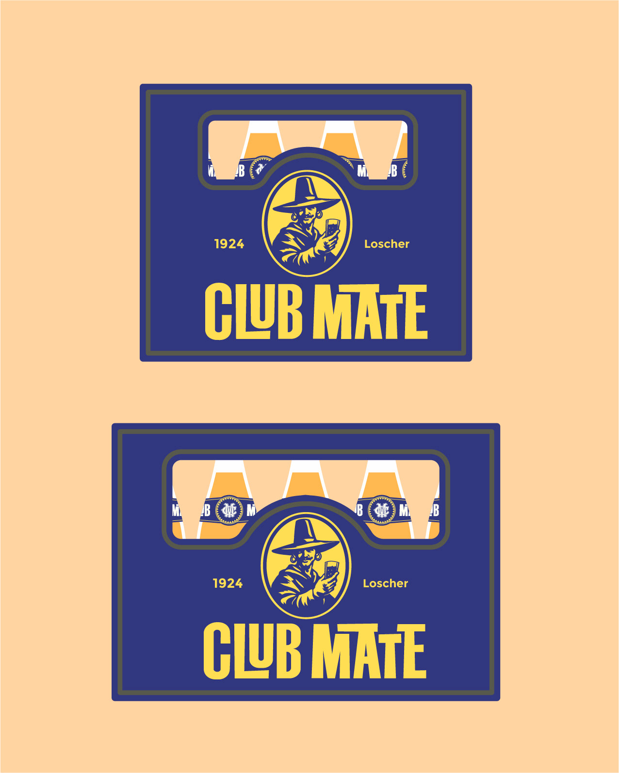
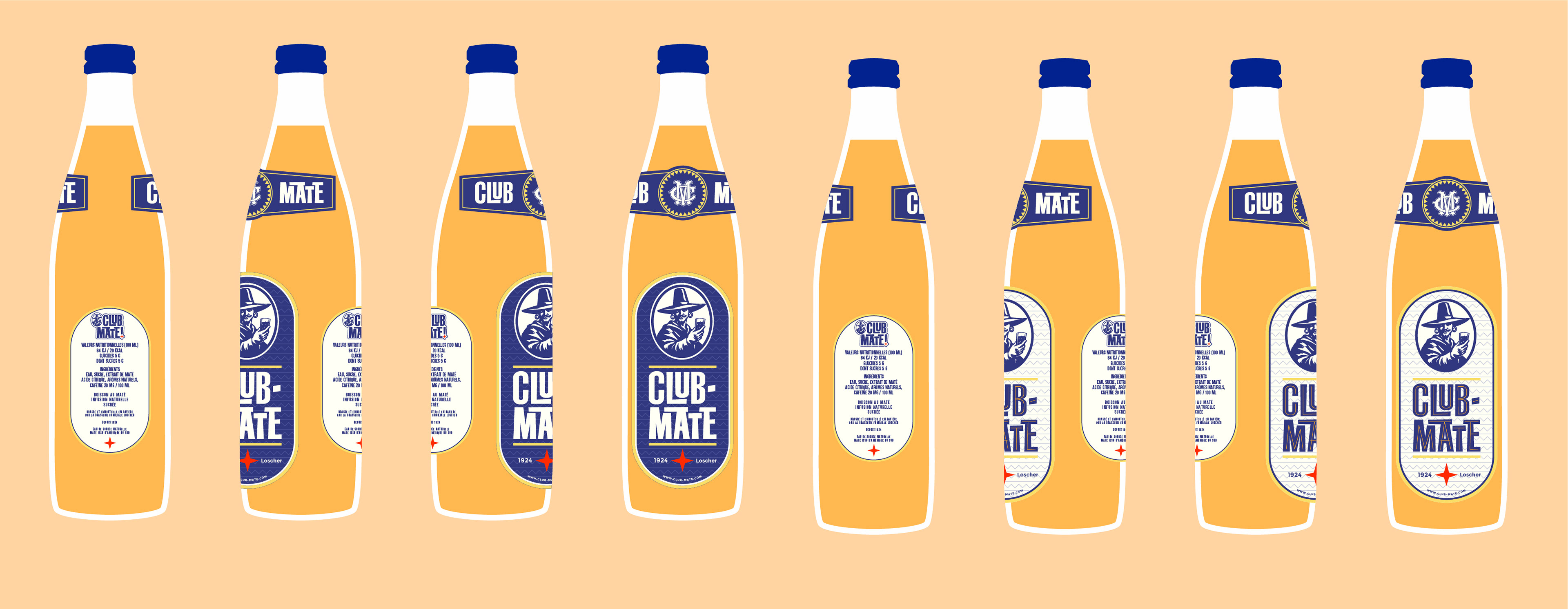
Développer une base graphique cohérente, capable de s’étendre sur différents supports (packaging, digital, éditorial)
sans perdre en identité.
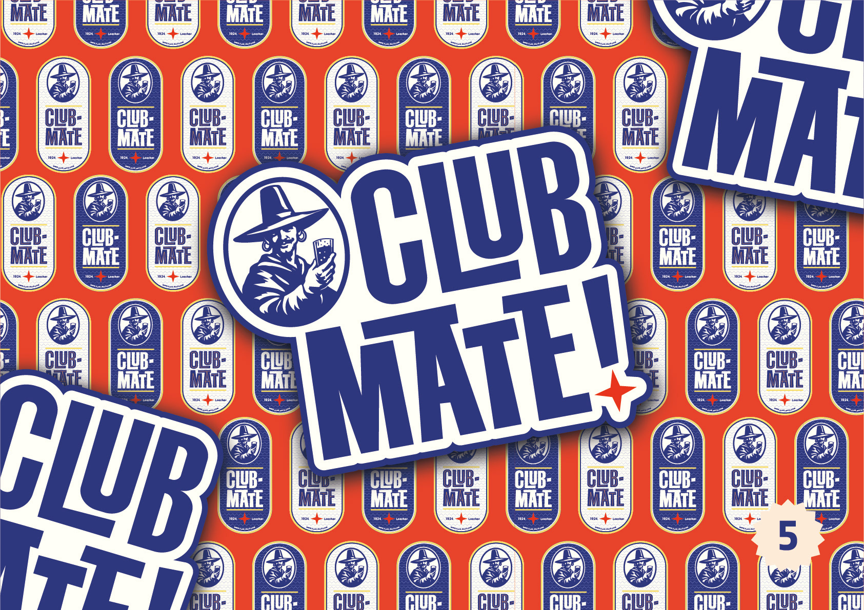
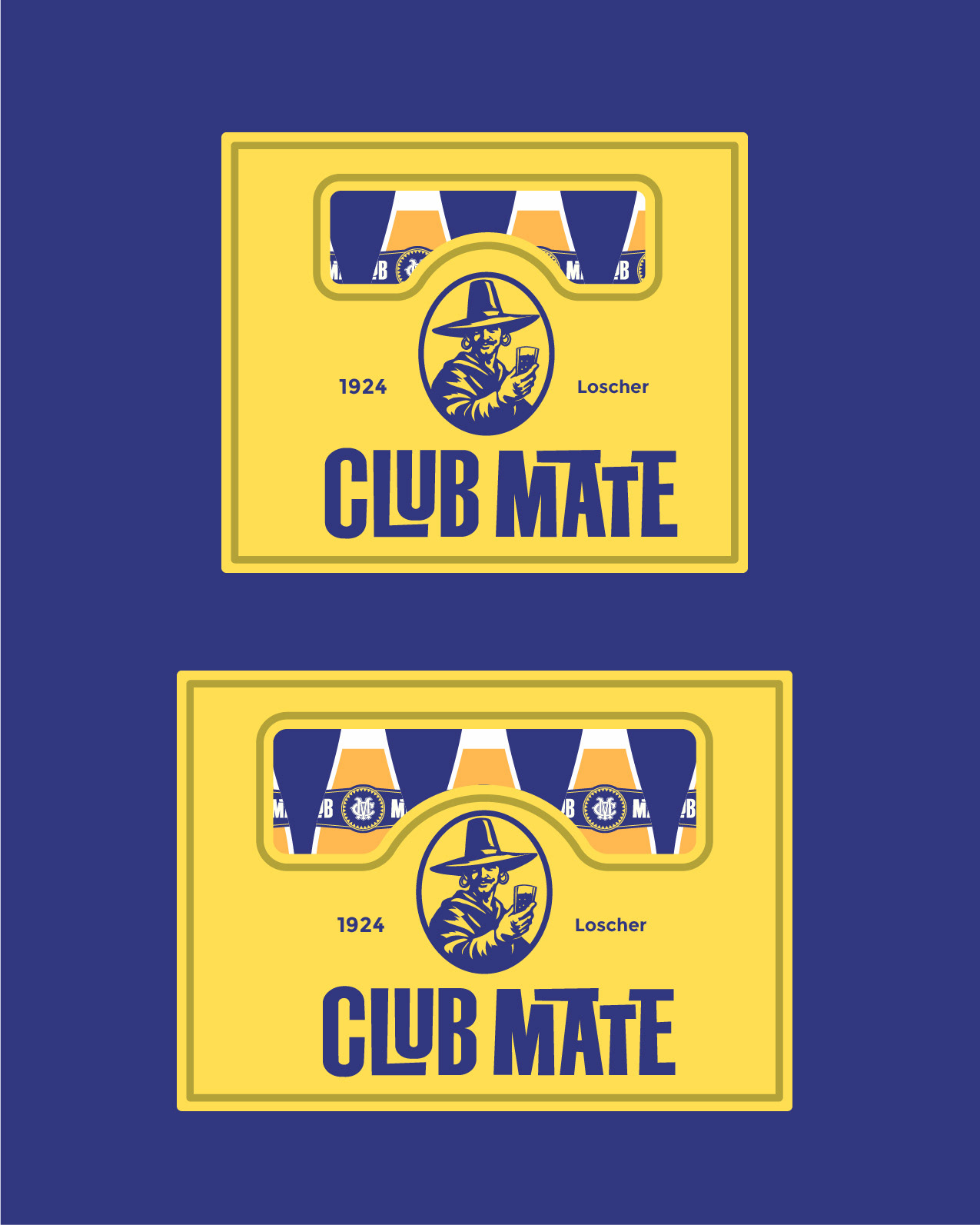
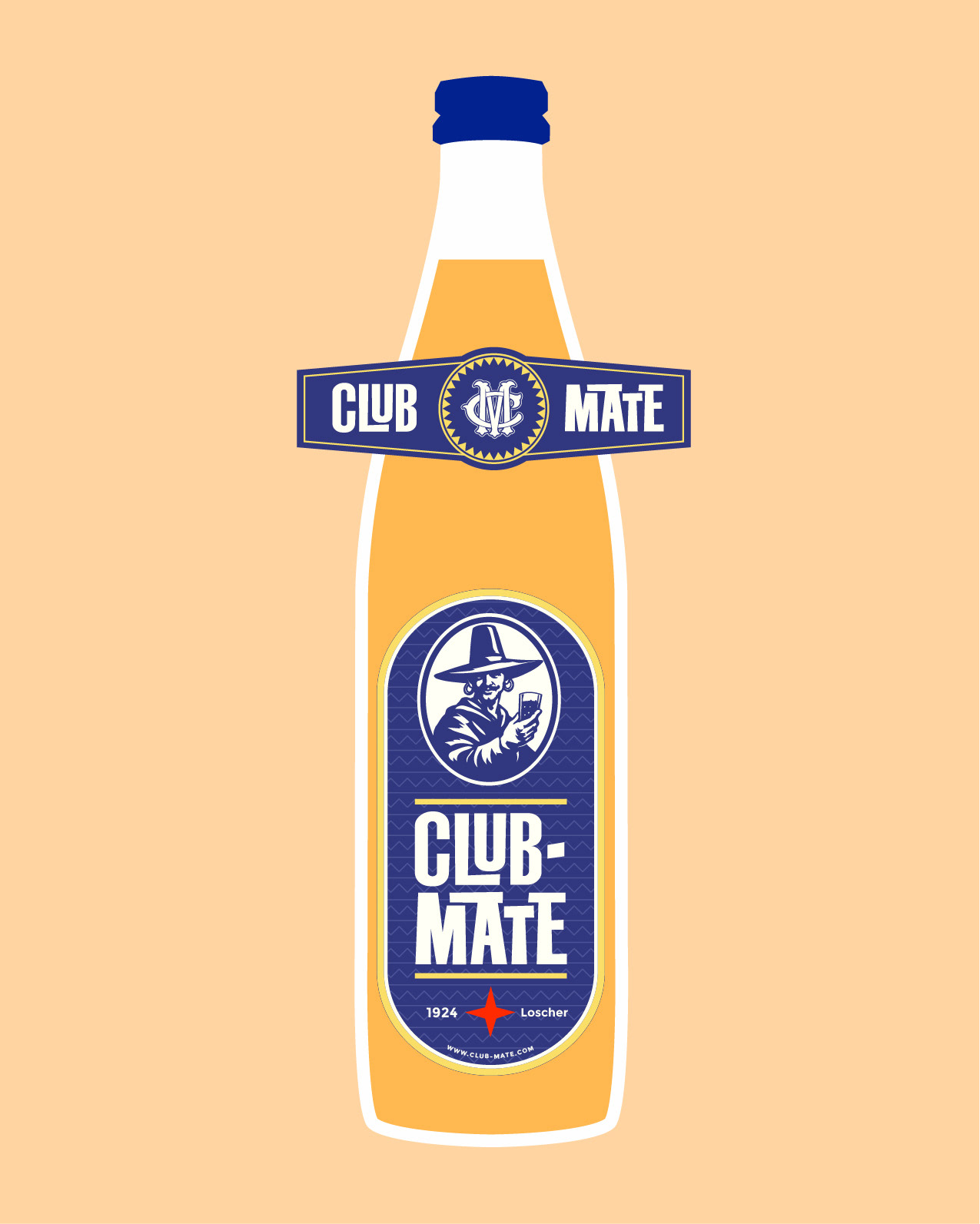
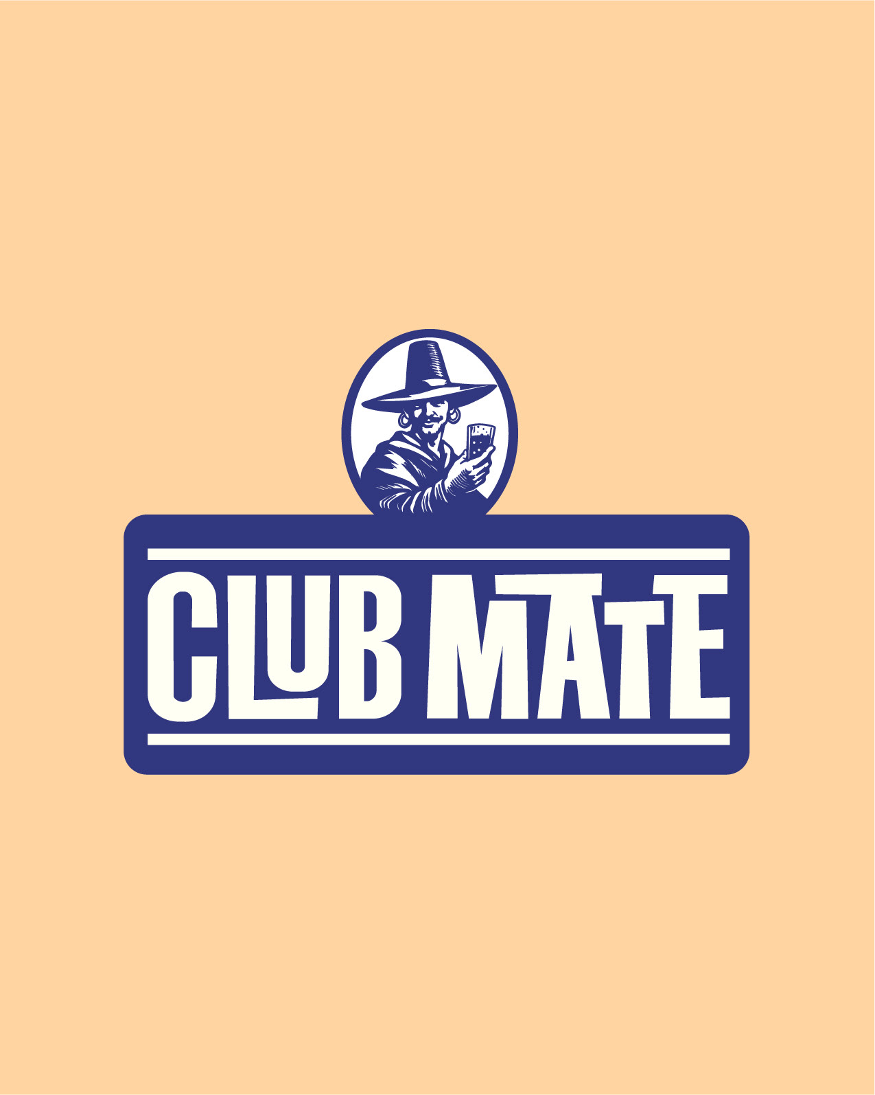
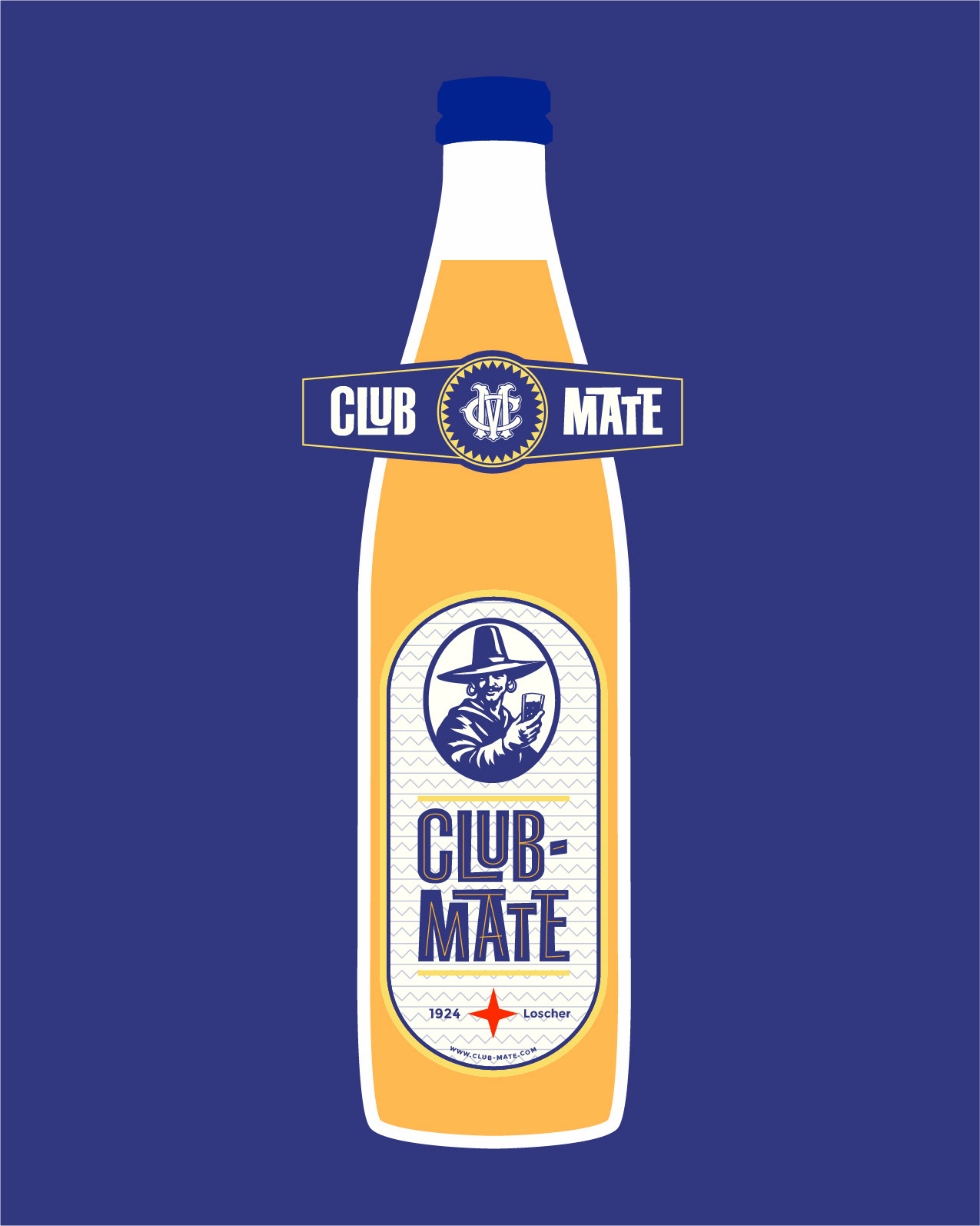
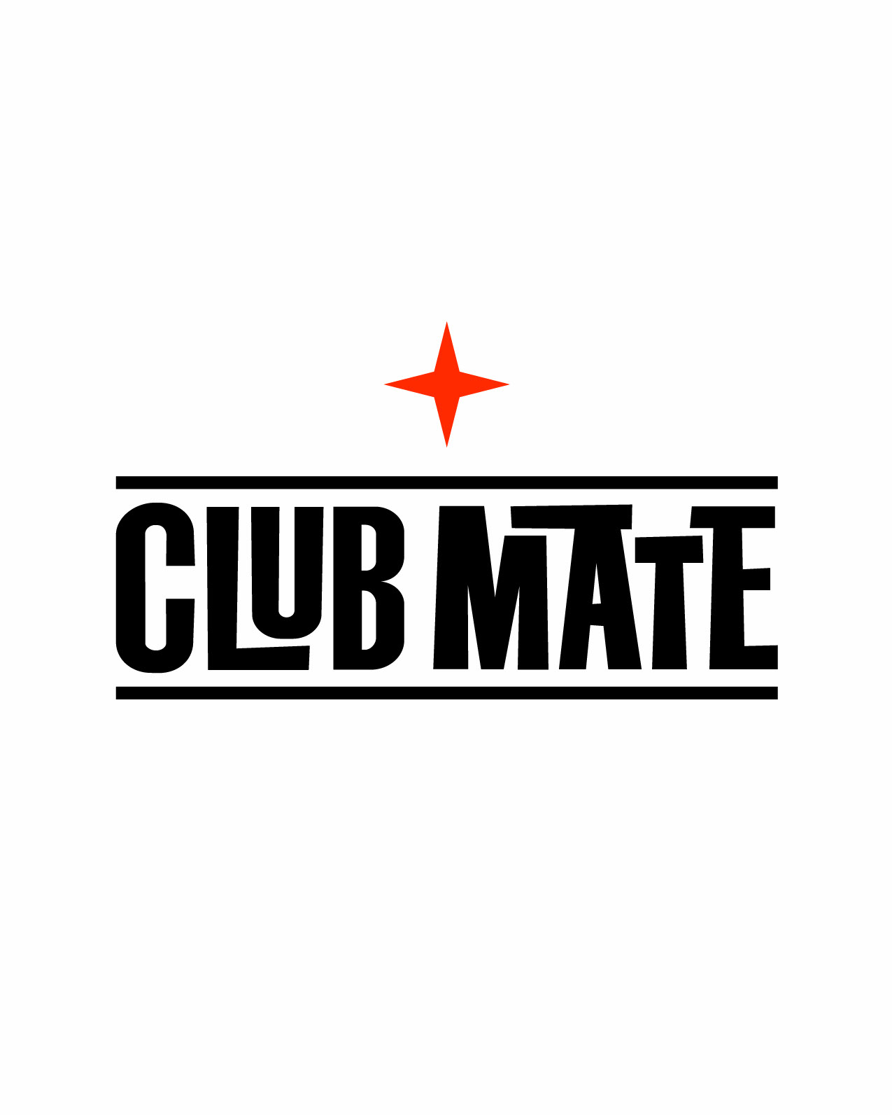
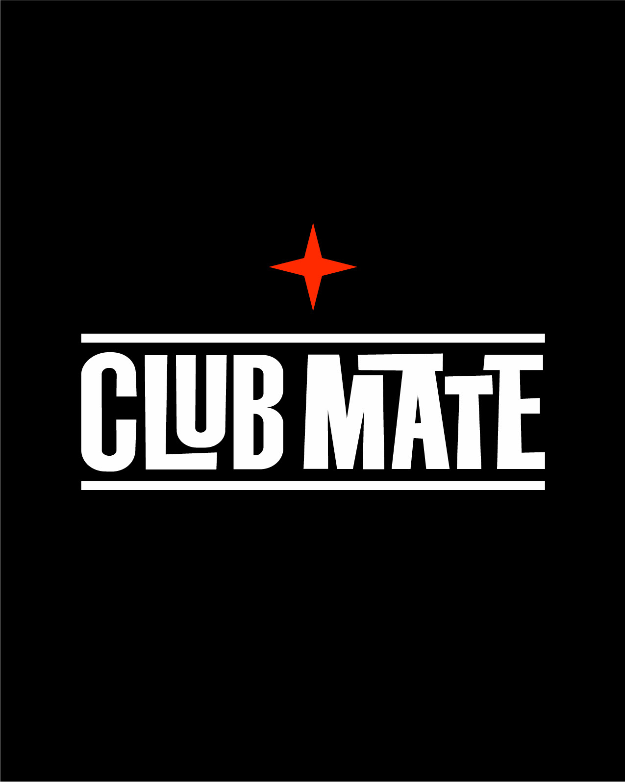
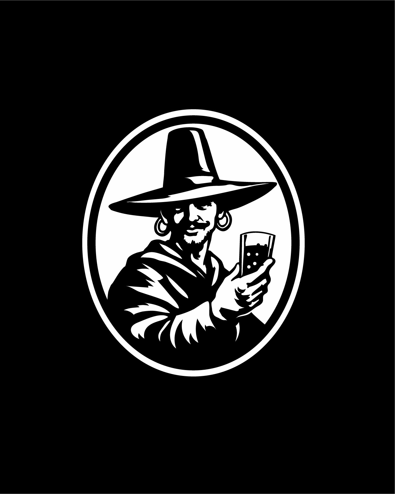
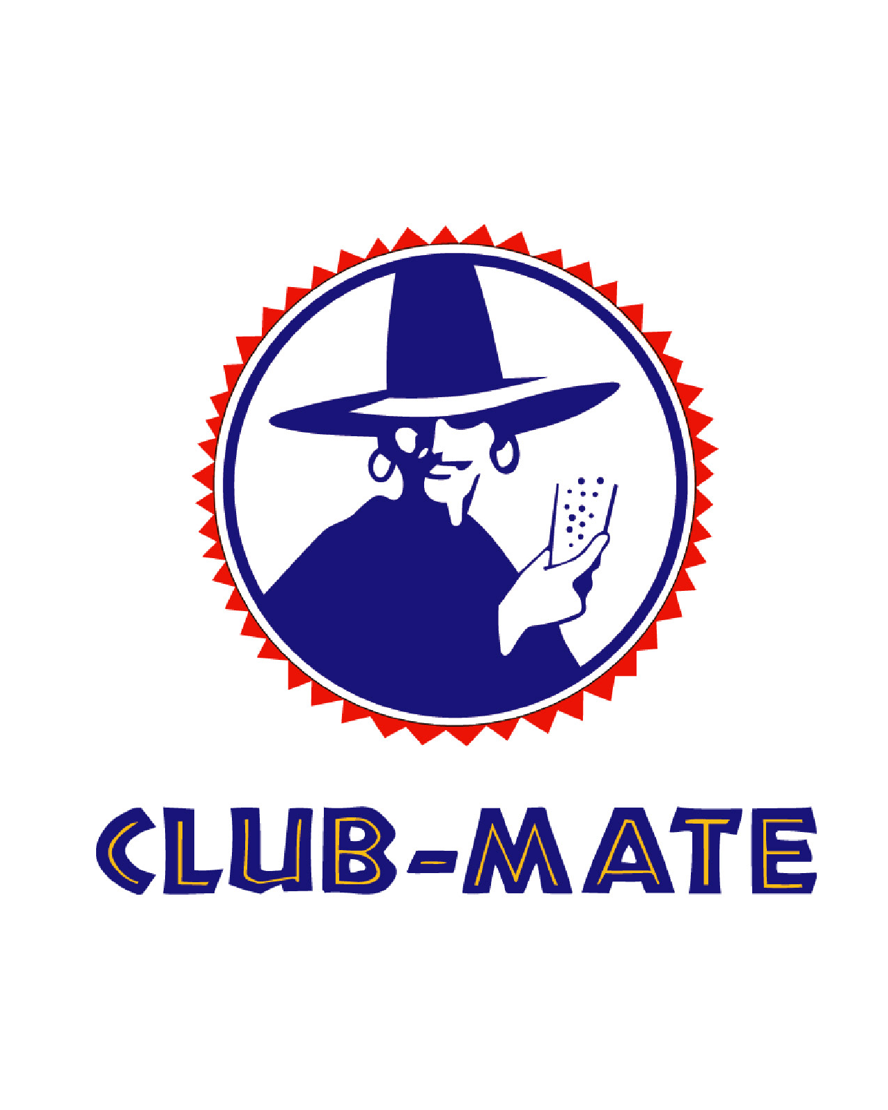
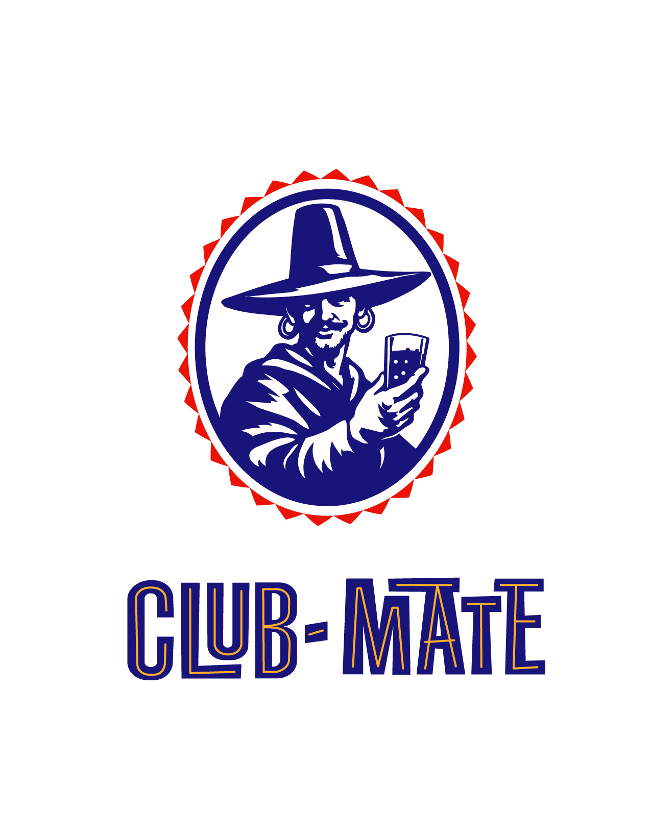
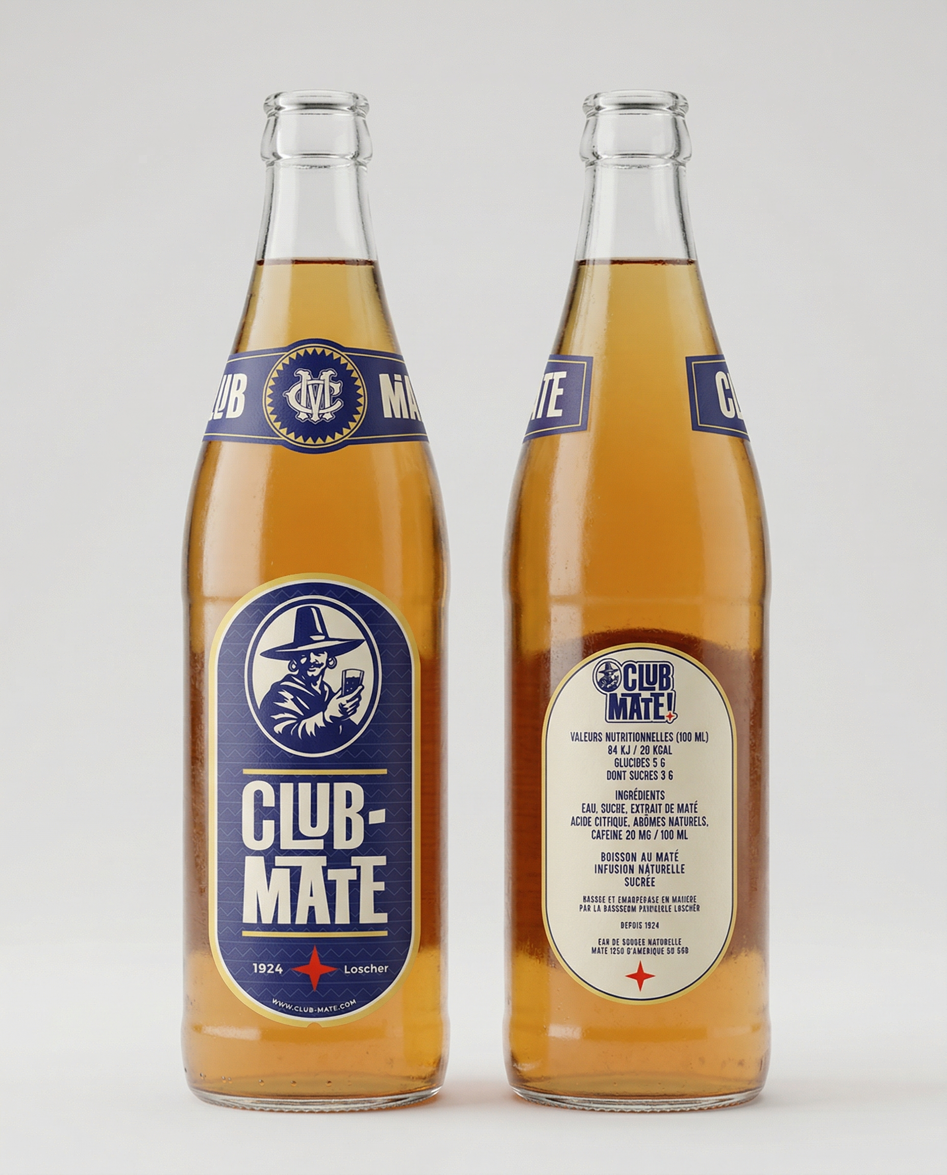
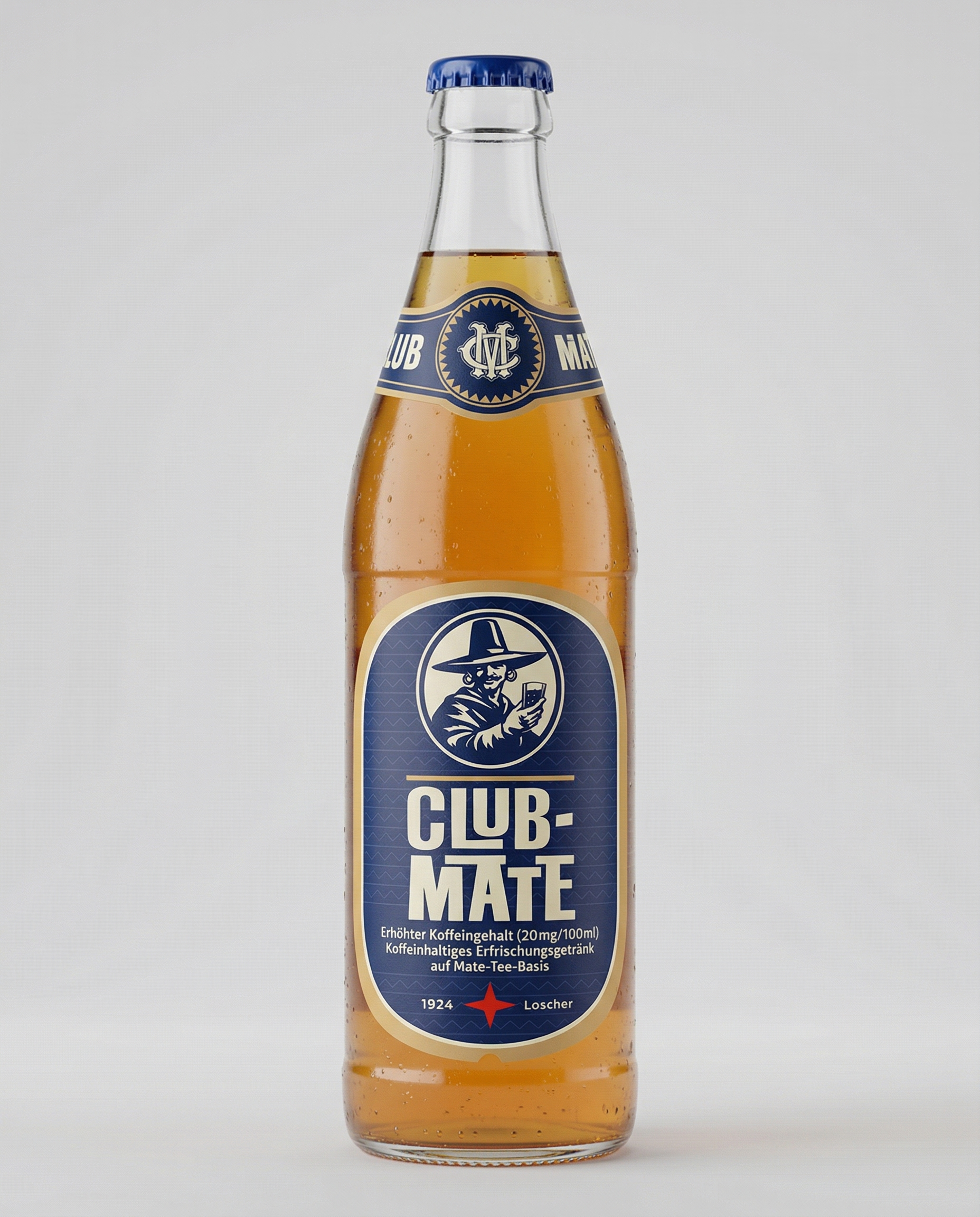
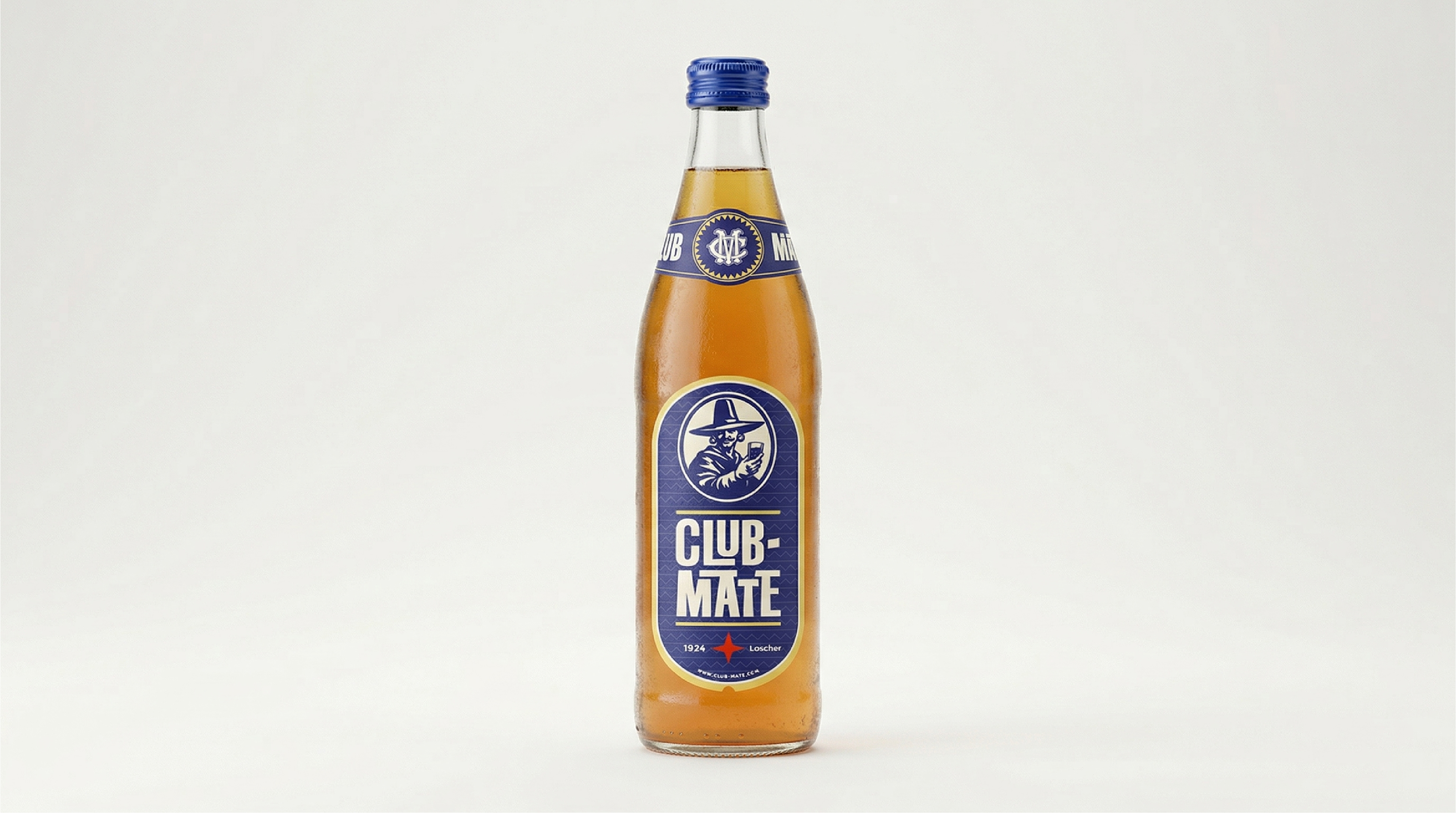
Le design de la bouteille reste volontairement inchangé. Le travail se concentre sur l’étiquette : typographie, hiérarchie, densité d’information et perception globale en rayon.
Ce projet s’inscrit comme une exploration visuelle.
Il ne cherche pas à redéfinir la marque, mais à révéler son potentiel avec plus de précision.
CLUB-MATE — Conceptual Rebrand
This project explores a complete visual rework of Club-Mate, while preserving what defines it: a functional, raw product rooted in alternative culture.
The intention is not to modernize for the sake of polish, but to clarify and reinforce existing codes. Club-Mate already holds strong cultural equity. The challenge is to structure that strength, not to replace it.
The work is built around three core directions:
— Clarity —
Refining graphic elements to improve readability and immediate recognition.
— Visual tension —
Balancing industrial heritage with a contemporary approach. A restrained, almost utilitarian aesthetic, avoiding over-design.
— System —
Establishing a coherent visual foundation that can scale across packaging, digital and editorial contexts.
The bottle shape remains untouched.
The focus is on the label: typography, hierarchy, information density, and overall shelf impact.
This project is a visual exploration. It does not aim to redefine the brand, but to reveal its potential with greater precision.